


Google rolls out Messages home screen redesign that drops the nav drawer
Google Messages Home Screen Redesign, Replace Nav Drawer For Beta Users
The Google Messages app just got a sleek makeover, making it a hot topic in the rapidly evolving tech world. You can say goodbye to the old navigation drawer as a burst of branding revives Android apps. Be prepared for a whole new messaging experience!
The journey of updates began a few days ago, with Google frequently releasing tweaks and improvements. However, the spotlight now shines on the latest update for Google Messages, which is making waves among beta users. The update, bearing the unique identification build code “20230719_05_RC00 version,” is currently undergoing server-side deployment, so it might not be accessible to all users just yet. But fret not, as these enhancements are in the pipeline as part of Google’s ongoing testing efforts.
Also Read | Transforming Search Experience with Instant Article Summaries Powered by Google AI

A beta version of Google Messages with some exciting changes was introduced previously. This beta version, identifiable by the build number “20230717_01_RC00 version,” teased an app bar with a dark shade or dynamic color instead of the traditional flat upper section. However, it seems that users have been eagerly awaiting the full spectrum of changes promised in the company’s update.
Read Also | 25 years of Google dominating the internet
Home Screen Redesign for Google Messages
Google embarked on testing the home screen redesign for Messages back in June, and it’s now on the verge of rolling it out widely to stable users after months of beta testing. So, what’s in store for the messaging experience?
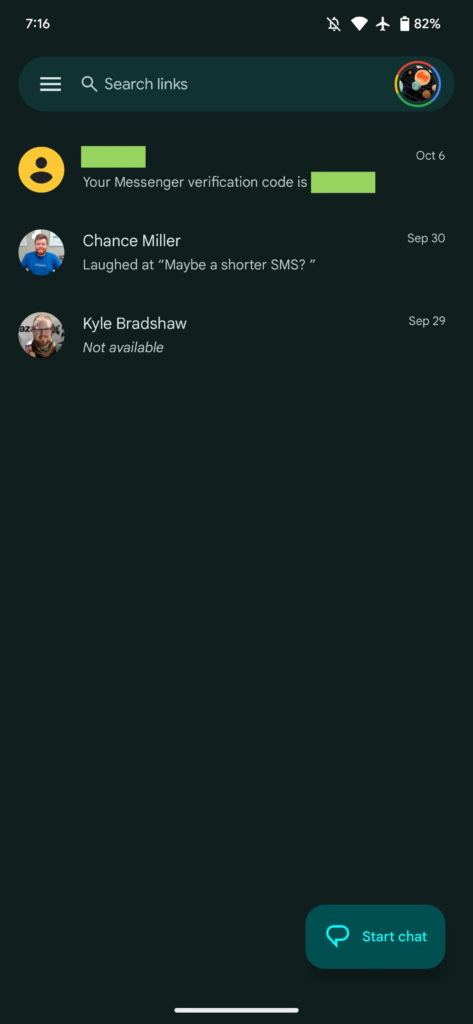
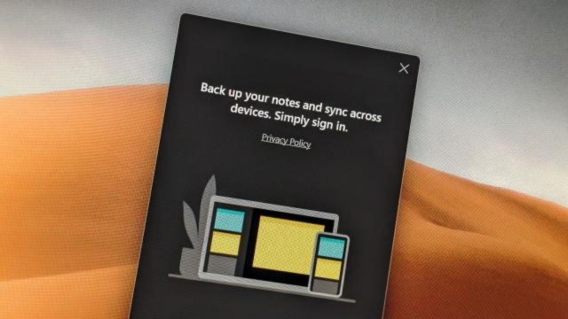
Say goodbye to the search field, and say hello to an eye-catching app bar graced with the iconic four-color “G” logo, followed by the word “Messages” and a magnifying glass icon. This branding is prominent and underlines Google’s commitment to delivering a top-notch messaging experience through RCS (Rich Communication Services).
The most significant change lies in the elimination of the navigation drawer, which gives the app a modernized feel. Instead, essential options like Archived, Spam & blocked, Mark as all read, and Device pairing can be found by tapping your profile avatar in the top-right corner. A helpful prompt bubble explains that these items are now conveniently consolidated in one place, along with app settings.
The search feature also gets a makeover, with a smaller but still noticeable touch target. Now, users are presented with a grid of categories instead of the previous carousel. This new design includes a shortcut to access your Starred texts/chats and filters for Unread, Known, and Unknown, Images, Videos, Places, and Links.
As part of this transformation, the Message organization feature introduced last year bids adieu. The tabs at the top for All, Personal, and Business messages are gone, but the “Auto-delete OTPs after 24 hrs” option remains in settings.
Also Read | Meta AI Assistant and Facebook-Streaming Glasses Revealed
Google Messages users on the stable channel are beginning to experience this exciting home screen redesign. If you haven’t received it yet, you can try “Force stop” from the App info menu. It took some time for Google to introduce these changes widely, and while it hasn’t been officially announced, it joins other recent home screen launches like the prominent RCS badge and read receipts in the conversation list.
Google’s commitment to improving the messaging experience is evident in this home screen redesign for Messages. With a fresh look, streamlined options, and a touch of branding, it promises to elevate your messaging game. So, keep an eye out for the update, and get ready to explore the future of messaging with Google!